1) Keep it simple
From a navigation bar to search tools to event promotions, you have countless tabs and buttons on which donors can click. While there is certainly a time and place for all of these aspects of your organization, please keep them far away from the donation form. These aspects are all important to your organization, but when you present them all on one webpage, you can overwhelm and frustrate donors. Ultimately, you want the donation button to be the first thing they see.
Next, when a donor goes to your online donation form, ensure the page is simple so they can easily complete the action of donating. Generally, people don’t want to give countless pages of information or spend hours filling out long forms. So to ensure potential donors don’t get upset and walk away – limit the information needed on your donation form.
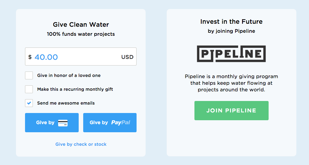
A great example of an online donation form is on the charity:water website. They start with the important things: how much you want to give and how you want to give it. They then break it down into short, digestable chunks of necessary information for credit card processing. This organization is very good at ensuring they only ask for vital information.
The Takeaway: Simplify your online donation form to make it easy for people to donate to you.
2) Going mobile is a necessity.
Your organization needs to take its platform mobile. Yesterday.
Reports are predicting that mobile usage will exceed desktop usage within the year (2015). If you don’t use a website analytics tool, you might be surprised to learn how many of your donors are already using a mobile device on your website. If you do use an analytics tool, narrow your search to just your donation form. Set your date search for the last year or two, and see how many people are visiting that specific page from a mobile device. You’ll most likely discover that mobile traffic (on arguably your most essential webpage) is vast and growing.
The Takeaway: Boost online fundraising performance with donation forms that work well on every smart phone.
3) Brand it.
Though this tip is certainly easier said than done, it is extremely beneficial to your organization. Building your brand is difficult; it takes dedication, strategy, critical thinking, time and, of course, money. Yet, without ensuring your organization is branded (and branded well), you will be losing out on a large number of potential donors.
A great example to look at is CARE Canada’s donation form. The donation form is fully branded and there is no disconnect when moving from the website through to the end of the form. By doing so, the potential donors of CARE Canada can feel secure that they are in the right place and it gives a sense of trust to the donor. You also increase the probability that a donor will follow through and complete their transaction.
The Takeaway: Brand your donation forms well so every donor will know it’s you and follow through to complete the transaction!
4) Be an attention grabber.
Getting people to come to your website is only the first step; it doesn’t do much good if you can’t keep them there. The key, once you’ve gotten a donor on your website, is to hold their attention. You need to draw them in to your “donate now” button.
The organization Room to Read does this very well. When you land on their home page, you’ll notice their big “DONATE” button fairly quickly. This organization is not afraid to make their fundraising the most important aspect of their website. They remind customers of new campaigns that are ongoing and use strong imagery and bring colours to attract the attention of donors.

The Takeaway: Be bright, bold and unapologetic when it comes to the fundraising aspect of your website. Donors are looking, so make it easy for them.
5) Visuals are powerful.
When someone is researching an investment opportunity or a product to buy, they like to be able to see what they are spending their money on. You’ve probably noticed that most online stores have countless product images, and that’s because consumers want as many visual aids as possible. It’s the closest thing to touching and feeling the product or experiencing the service online.
Organizations like CARE Canada and The Red Cross do well at making their websites very visual. Though they are simple designs and images, these two organizations help donors see the real value and impact of their contribution.
Takeaway: Use commanding imagery throughout your website to make the donation experience as tangible as possible for people.
Source: http://npengage.com/nonprofit-fundraising/boost-donor-acquisition-online-fundraising/